A PR report is the crown of your PR campaign. It is the best way to present what you did and the results it produced. In fact, many of your clients will decide to either move forward with you or cancel your services simply by looking at your report.
Still, so many PR professionals are getting it wrong.
💡 Read Digital PR Explained: Best Strategies and Tools
There are a few reasons for this, all of which we will cover in this blog. To help you better understand what is actually important and worth reporting, we have also compiled five PR report templates you can use for your next campaign, along with a breakdown of the PR metrics included in each.
Let’s dive in!
PR Report Checklist: 3 Key Steps
First things first, let’s backtrack a bit and establish the foundation of your PR report. To truly present and prove the value of your work, there are 3 key steps to keep in mind:
1. Identify the goal of your PR campaign and that one essential chart
As is often the case, quantity trumps quality simply because people tend to think more data should speak in their favor. The end goal tends to get lost in the abundance of information, the majority of which is simply not relevant, but admittedly looks nice.
In fact, there are two types of clients we’ve come across while building Determ’s custom charts. The first type wants to include as much data as possible, while the second type is the polar opposite and wants to minimize the amount of data.
For the longest time, I was the first type.
I thought that the only way clients would be able to understand the results was if I made an impressive document with 50+ charts and a detailed campaign breakdown. Something which, when printed and bound, looked majestic, almost like a scientific paper.
But my colleagues said:
If you can’t understand a chart from looking at it, it shouldn’t exist.
And they were right.
A client is interested in something that’s straightforward. Long-winded descriptions are the opposite of that.
Imagine that the client judges the success of your campaign from a single chart. What would that chart contain? Would you be wasting their time on convoluted descriptions and dozens of data points? If not, why are you doing it now?
Before writing your PR report, think about that one essential chart that simply needs to be there. You’ll oftentimes find that your PR metrics are tied to business outcomes. For example:
- 1,000 sales > 1,000,000 impressions
- 560 pledged voters > 560 articles
- 200 new subscribers > 5,000 shares
2. Use the inverted pyramid strategy
The first page of your PR report should feature a short summary, ideally no longer than 2 paragraphs.
The summary should follow the traditional news reporting rule of the inverted pyramid. That means communicating the most important information at the beginning and providing less important information in the details below.
I like to start it with the end result first, and then work my way backward:
The goal was to achieve X. The campaign achieved Y. This is phenomenal because it is twice as good as we expected – oh, and also twice as good as what the competitors did. We did it with these 20-30 activities. In the next couple of pages, we’ll go into more detail about what happened and why.
Those interested in learning more can then go on reading, with a clear picture in mind of what they are seeing. Executives don’t have to. They have all the info right there.
Read Media Monitoring Reports: all you need to know
3. Prune unnecessary data from your PR report
A good PR report is 90% data collection and analysis and 10% actual writing.
Say you were running an Instagram campaign for a client, which lasted for a month. You might feel compelled to include this general sentiment graph:
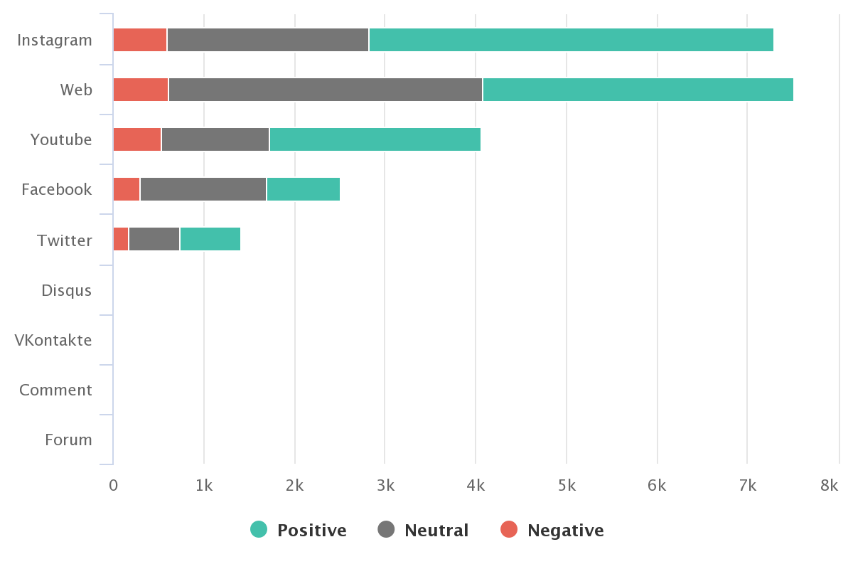
But does your client really need as much data, if the campaign ran only on Instagram? The chart can be replaced with a sentence about Instagram being the client’s second most popular channel after websites.
Opt instead for a chart that focuses on sentiment results from Instagram over time:
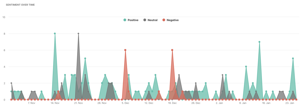
This chart tells the client everything they need to know – the number of mentions and their sentiment over time. It is focused on the campaign you were actually doing, which is far more interesting than the data shown in the chart above.
Still on the fence about the amount of data to include in your PR report?
Some people will have questions about your methodology. They will want to know more about total mentions, tonality, sentiment, reach, engagement, and other metrics.
Go on, include all these graphs. Just make sure you follow the inverted pyramid rule and put them last, rather than first. Stop fearing that clients will think you didn’t do any work – in fact, the opposite is probably the truth.
Although it may sound counterintuitive, deleting half of your PR report will likely result in instant improvement. By doing so, you focus on the actual results, and not the fluff surrounding them. Moreover, it saves everyone’s time, and that in itself is something we can all appreciate nowadays.
PR Report Templates and Key PR Metrics to Include
Now that we have gone through the basics, let’s delve a bit deeper into PR report templates and PR metrics to look out for. They are a clear overview of your media monitoring data, all in one place, curated specifically for your goals and needs. Usually, PR reports contain data about:
- ongoing campaigns,
- brand reputation,
- crisis management,
- competitors,
- strengths and weaknesses,
- influencers,
- customers…
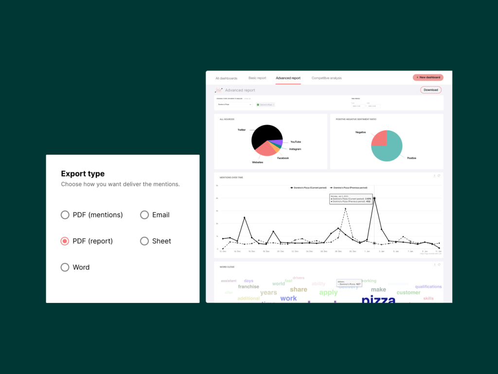
But, as we previously mentioned, not all of this data might be necessary to include. Yet, if you need a PR report template that covers the majority of this information, you can turn to Determ’s predefined reports.
The Basic report, Advanced report, and Competitive analysis are templates that fit the majority of reporting needs and goals, while also catering to the specific focus of your efforts.
But, to truly utilize the potential a great PR report template can unlock, we advise you to look into customizing the content and look of your PR reports.
You can either customize existing templates to tailor them for your needs or start from scratch and create something truly unique. The latter will be demonstrated in the next section, so let’s start exploring various PR report templates you can use for your next campaign!
Basic report
The Basic report, as the name suggests, contains a quick overview of some basic metrics. It includes data about the number of mentions, total impressions, sources, and sentiment. Additionally, there is a Locations chart and a simple Word Cloud.
PR metrics in the Basic report
Let’s take a look at some of the PR metrics contained in the Basic report:
NUMBER OF MENTIONS & TOTAL IMPRESSIONS
The Number of mentions and Total impressions are pretty self-explanatory PR metrics. Both show a number of mentions or estimated impressions in a chosen timeframe. Below the mentions or impressions count, there is a small percentage indicating the increase or decrease in comparison to the previous period.
For instance, if you’ve chosen to see the report for this month, the previous period would be the month prior. The data is an aggregate of all your mentions in the selected time period, all of which you can view by clicking on any of the numbers.
ALL SOURCES
Next, there is the All sources chart. This chart shows all the sources from which your mentions were pulled, as well as the share of each source.
To see the share of each source, hover your cursor over the source – this will enable you to see the exact number of mentions from that source, as well as its percentage. When you click on a specific source, a new window will pop up in which you can see all the mentions from that source.
The great thing is, having the share of mentions from each source will enable you to identify which channels your target audience uses to talk about your topic. And since you have this information at your disposal, you can create a strategy that focuses on those channels the most, without second-guessing or spending your budget testing various channels.
MENTIONS OVER TIME
The Mentions over time graph shows how your mentions performed over the selected time period. The number of mentions might be relatively constant or fluctuate, in which case you’ll probably see a lot of peaks and drops. Clicking on them will open a new window in which you can see all the mentions from that day and potentially identify what caused such an increase or decrease in mentions.
Once again, the previous period is shown in the form of a broken line, so you can easily compare how your mentions are performing over time.
SENTIMENT ANALYSIS AND SENTIMENT BY SOURCES
The sentiment analysis graph shows the ratio of the positive, negative, and neutral sentiment of your mentions, while the Sentiment by sources shows how that sentiment is distributed on various sources. Basically, it’s an overview of how your audience feels towards a certain topic, and more specifically, how the sentiment differs based on the source.
The automated sentiment analysis is based on the positive and negative sentiment of the expressions used in the text of the mention. If one sentiment prevails over others, the tool will allocate the matching sentiment. In case there aren’t any relevant differences, neutral sentiment is assigned.
By hovering the cursor over the sentiment (e.g. positive sentiment, the green piece of the pie chart), you can see exactly how many mentions were in a positive tone (both the total number and the percentage). Clicking will once again open a new window with positive mentions only.
LOCATIONS
The Locations chart is a map showing the countries from which your mentions originated, as well as the total number of mentions per country. The darker blue the country is, the more mentions came from it.
By hovering the cursor over a country, you can see the total number of mentions that came from it. You can zoom in on the map (click on the plus (+) sign) and zoom out (click on the minus (-) sign). Again, as was the case with the previous charts, you can click on a country to see a list of all mentions that came from it.
WORD CLOUD
Finally, there is the Word cloud chart. Word cloud shows you the context in which your topic was mentioned the most, that is, the words that were mentioned the most alongside your topic.
The size of the word increases proportionally to the number of times it was mentioned. The more the word was mentioned, the bigger the word in the word cloud and vice versa: the less the keyword was mentioned, the smaller the word.
The word cloud can be a great source of inspiration for creating content, titles, and campaigns, as it shows you what are people looking for when mentioning your topic.
Advanced report
If you need a detailed analysis of your data, click on the Advanced report. The Advanced report contains a breakdown of the most important metrics. In addition to the data found in the Basic report, here is where you’ll find the Mentions over time by source chart, Top influencers dashboard, a complete Sentiment analysis, Top Languages, and Top Locations charts.
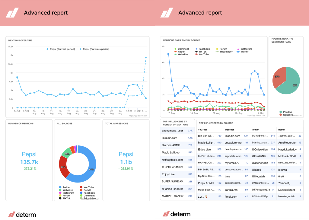
PR metrics included:
MENTIONS OVER TIME BY SOURCE
The Mentions over time by source chart shows how your mentions performed over the selected time period for each specific source.
You can easily exclude a source from the chart by clicking on that source’s name on the top of the graph. You’ll know a source is excluded from the graph when that title turns grey, and the line representing the is no longer seen on the chart. To include the source, click on that source again.
POSITIVE-NEGATIVE SENTIMENT RATIO
Once again, we’re looking at a sentiment chart. This one shows the ratio of positive and negative sentiment.
TOP INFLUENCERS BY NUMBER OF MENTIONS
The Top influencers by number of mentions is the first chart in the Influencer dashboard. This is a list of the top 10 influencers who mentioned you the most. On the left are influencers, and on the right, the number of times an influencer has mentioned you. If you click on an influencer, a window with a list of all their mentions will pop up.
TOP INFLUENCERS BY SOURCE
Secondly, there is the Top influencers by source chart, indicating who mentioned your topic the most on each source. The list of influencers is separated into columns – each column corresponding to one source.
TOP INFLUENCERS BY REACH
Just below, there is the Top influencers by reach chart. This list shows the influencers whose mentions had the biggest reach for each source individually. It is separated into columns – each column corresponding to a source. On the left of each column is the influencer, and on the right is that influencer’s reach.
TOP LOCATIONS AND TOP LANGUAGES
Moving on further, the locations and languages charts await. Other than the Locations map explained earlier, the Advanced report also contains the Top locations and Top languages charts.
The Top locations chart is a list of the top ten locations by the number of mentions. In other words, it shows you a list of the countries that produced the most mentions for your topic. By clicking on a country, you’ll open a window with a list of all mentions from that country.
Likewise, the Top languages is a list of the most frequent languages on which your mentions were published. If you click on a language, you’ll open a window with a list of all mentions published in that language.
The locations and languages charts are great indicators of how popular your topic is in a certain market. It might even help you choose a new market you might spread your brand presence.
SENTIMENT OVER TIME
In addition to the previously mentioned sentiment charts, the Advanced report contains the Sentiment over time as well. This graph shows positive, negative, and neutral sentiment over a selected period of time. Thus, you can see how the sentiment shifts and which sentiment prevails over time.
TOP INFLUENCERS BY SENTIMENT
The final chart that differs the Advanced report from the Basic is the Top influencers by sentiment, also the final chart forming the Influencer dashboard. It is a list that shows the influencers that mentioned you the most in positive and negative sentiment.
There are two columns – one column is for positive sentiment, the other for negative. If you click on an influencer, you’ll be able to see a list of all their mentions in the window that pops up.
And there you have it – we’ve covered the Basic and Advanced report. The third predefined dashboard to cover is called the Competitive analysis.
Competitive analysis
Competitive analysis is used when you want to compare two or more topics. It enables you to benchmark and gain competitive insight. That way, you can learn all about the strengths and weaknesses of a brand, product, market, and many more.
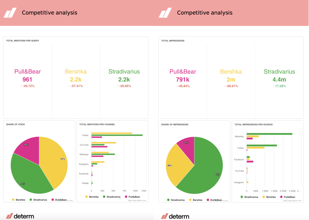
PR metrics included in the Competitive analysis
SHARE OF VOICE
The first one is the Share of voice. Share of voice acts as a measure of reach, and as such shows the share of exposure for selected topics. This graph shows the ratio of mentions between selected topics.
TOTAL MENTIONS PER CHANNEL
This graph shows the number of times each selected topic was mentioned on a particular channel. This way you can compare topic’s mentions across channels.
SHARE OF IMPRESSIONS
The ratio of impressions for selected topics is shown in the Share of impressions chart. It indicates the share of estimated reach each topic had out of the total number.
TOTAL IMPRESSIONS PER SOURCE
The Total impressions per source graph compares the distribution of impressions across sources for selected topics. It’s a great way to identify which channels had the biggest estimated reach per topic.
MENTIONS OVER TIME FOR MULTIPLE TOPICS
If you want to learn how your mentions are performing over the selected time period for each specific topic, check out the Mentions over time for multiple topics.
TOP INFLUENCERS
The Top influencers graph shows the top ten influencers for each selected topic. Those are the influencers that mentioned a topic the most. You can see the influencer on the left of this graph, and the number of mentions per influencer is on the right.
Using this chart, you can compare which users and media mention you and your competitors the most, and then compare if and how they differ. You could even contact the influencers that mention your competitors, but not you and try to pitch them your product and its benefits. Who knows what opportunities might come out of this?
NUMBER OF MENTIONS PER SENTIMENT
The Number of mentions per sentiment graph shows the distribution of the positive, negative, and neutral sentiment for each selected topic. It is an amazing way to generally compare the context in which both you and your competitors are mentioned respectively, as well as the amount of each sentiment category.
MENTIONS BY CHANNELS
And to check the sentiment for each topic in even more detail, use the Mentions by channels chart. It shows the distribution of mentions for each selected topic across different channels so you could see exactly compare how the audience reacts to each topic on a specific source.
You might find your content is well received on the web but is not so well spoken of on Twitter, where, on the other hand, your competitor is thriving. This is a good starting point in reevaluating your strategy and adjusting the elements that might be lacking in performance.
Sentiment analysis
The Sentiment analysis is an example of a fully custom PR report template you can create in Determ. If you need only specific information, you can curate your own dashboard and then add graphs and charts that are the most relevant to you.
Here’s how it looks:
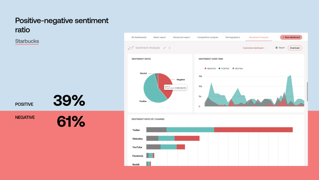
As you can see, I’ve simply compiled the charts that I find would be the most interesting if I wanted to report on sentiment only.
You can choose, edit and arrange the charts as you wish. That way, you can completely tailor the report to your needs and goals to get the right message across.
Branded reports
You can also customize the visual aspect of your report. Check out our blog on Branded reports to see how you can achieve this:
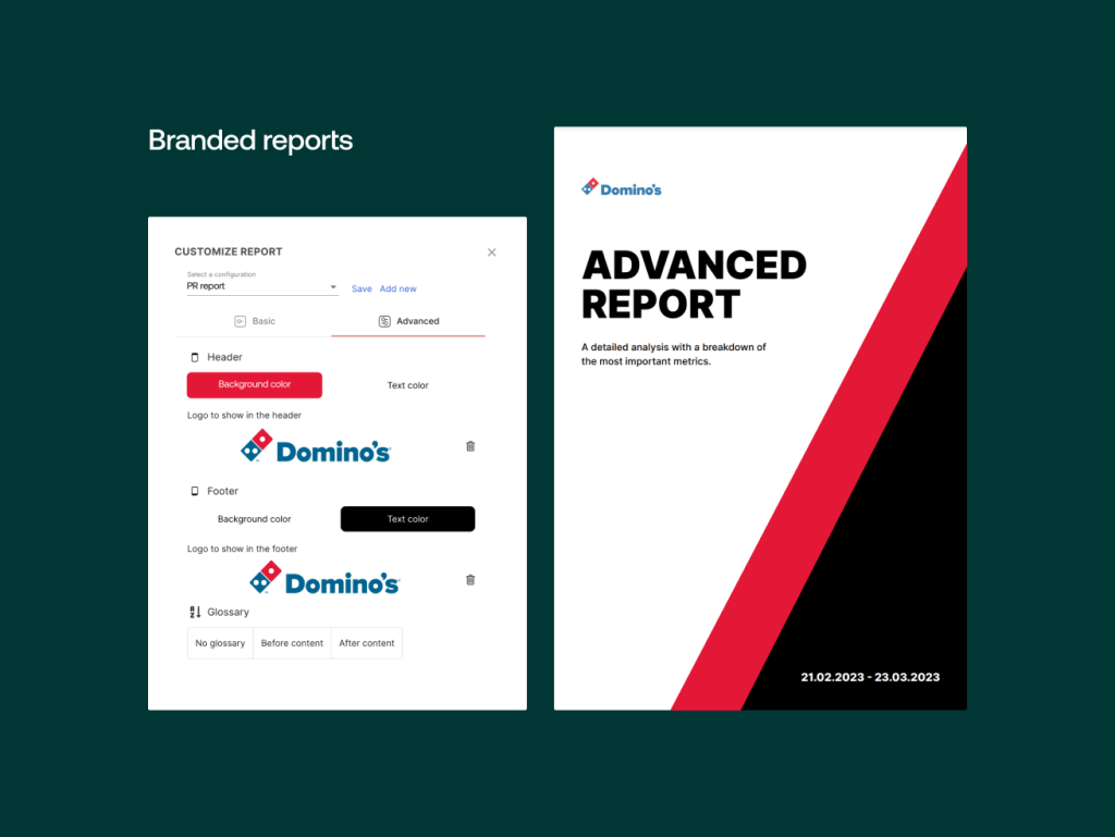
We’ve updated our brand reports with the option to fully customize them and create Branded reports with your own logo, color scheme, title, and so much more. It’s a great way to share data with your colleagues, team leaders, or clients, all while staying consistent with your brand image and visual identity.
Read 8 Ways Determ Can Help in Creating PR Reports for Your Boss
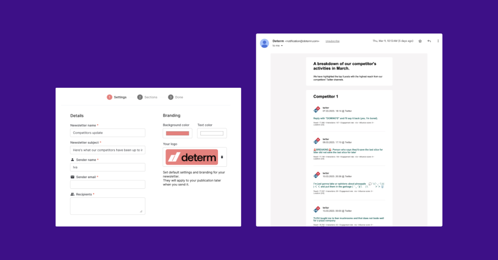
Newsletter
This feature helps you inform internal and external stakeholders about relevant online content. Curate a list of articles and posts from your Determ Feed and distribute it to your team, clients, or partners as an email newsletter.
With this new feature, you can:
- Share the latest media coverage about your company
- Highlight reactions to your campaigns, products, or services
- Showcase your company’s content from the web and social media
- Keep everyone posted about your competitors and industry trends
- Select a list of articles or posts by any criteria of your choice.
To Sum Up on PR Reports and PR Report Templates
As we established, PR reports are the crown of your work and the greatest way to prove the value of your efforts.
And while traditional data-packed reports are visually attractive, don’t get deceived by the thought that you actually need to report on all that information. For that reason, we’ve written about the three key steps to keep in mind when preparing your report, as well as a number of PR report templates and their PR metrics.
Feel free to use them and let us know what custom PR reports would you like to (re)create.
Interested in finding out how your brand performs? Use Determ to find out.