Media monitoring in itself is a great means of getting an insight into any topic of interest. Be it your brand, competitors, or industry in general, you can get to know the ins and outs of virtually everything by tracking relevant online conversations and keeping an eye on the analytics behind them.
Well, there’s even more to media monitoring analytics than meets the eye. Having the option to customize predefined charts and dashboards or create custom ones from scratch will unlock the world of possibilities for your business.
Not every media monitoring tool enables this, but luckily, Determ has got you covered.
Custom charts and dashboards are a goldmine of unique insights into media intelligence that is key for gaining that competitive edge. With virtually endless customization options, all it takes is a bit of creativity and a simple setup process we’ll guide you through in this blog.
Here’s what you’ll learn:
Let’s dive in!
Benefits of using custom charts and dashboards
Predefined charts and dashboards are a go-to option for the majority of our clients – after all, they do contain the most important metrics you’d need to report about your efforts. Using them is a no-brainer.
But, for those who want to explore what is outside the box, custom charts and dashboards allow for conducting advanced PR or marketing analyses.
That being said, the benefits of curating bespoke analytics include:
- Freedom to choose which data and how much of it you want in your report,
- Flexibility in the way the output of your data is presented,
- A granular approach that contributes to unparalleled level of detail in analysis and reporting,
- Numerous personalization options that can be applied to each and every report to match your exact data needs, the desired report layout, and your or your client’s visual identity,
- Automation in terms of creating a dashboard that can be applied to various topics and scheduled to be automatically sent to whomever it may concern at a set frequency.
There are numerous use-cases for creating custom charts and dashboards.
For instance, when reporting about the success of a client’s campaign, you can dedicate a part of your report to the campaign itself and the other part to the comparison of the campaign and the competitor’s activities.
Or, you could go deep into the unchartered territory of combining multiple data points and create a fully unique custom chart, like an in-depth sentiment analysis for multiple tags on various topics. Talk about competitive advantage!
Examples of Custom Charts and Dashboards
Before showing you exactly how to create custom charts and dashboards, let’s take a quick look at just how powerful customization can be in terms of provided data and added value.
Here are a few examples of custom charts and dashboards we created to get you started, or inspired.
Sentiment analysis dashboard example
Sentiment analysis is one of the most powerful tools when it comes to tracking the performance of a topic, as well as a crucial part of any PR or marketing report. Being a great indicator of the general attitude and receptiveness towards your topic, sentiment analysis is a topic you can dedicate an entire dashboard to.
To demonstrate, we created a custom dashboard containing every available sentiment chart in Determ, predefined Number of mentions, All sources, and Total impressions charts, as well as a custom Mention chart and Sentiment by tag chart we’ll elaborate in just a bit.
This is the result:

Mention chart example
The Mention chart is a great way to showcase a select number of mentions by criteria of your choice. That way, you can see some of the most important mentions from your feed at a glance and include them in your report as well.
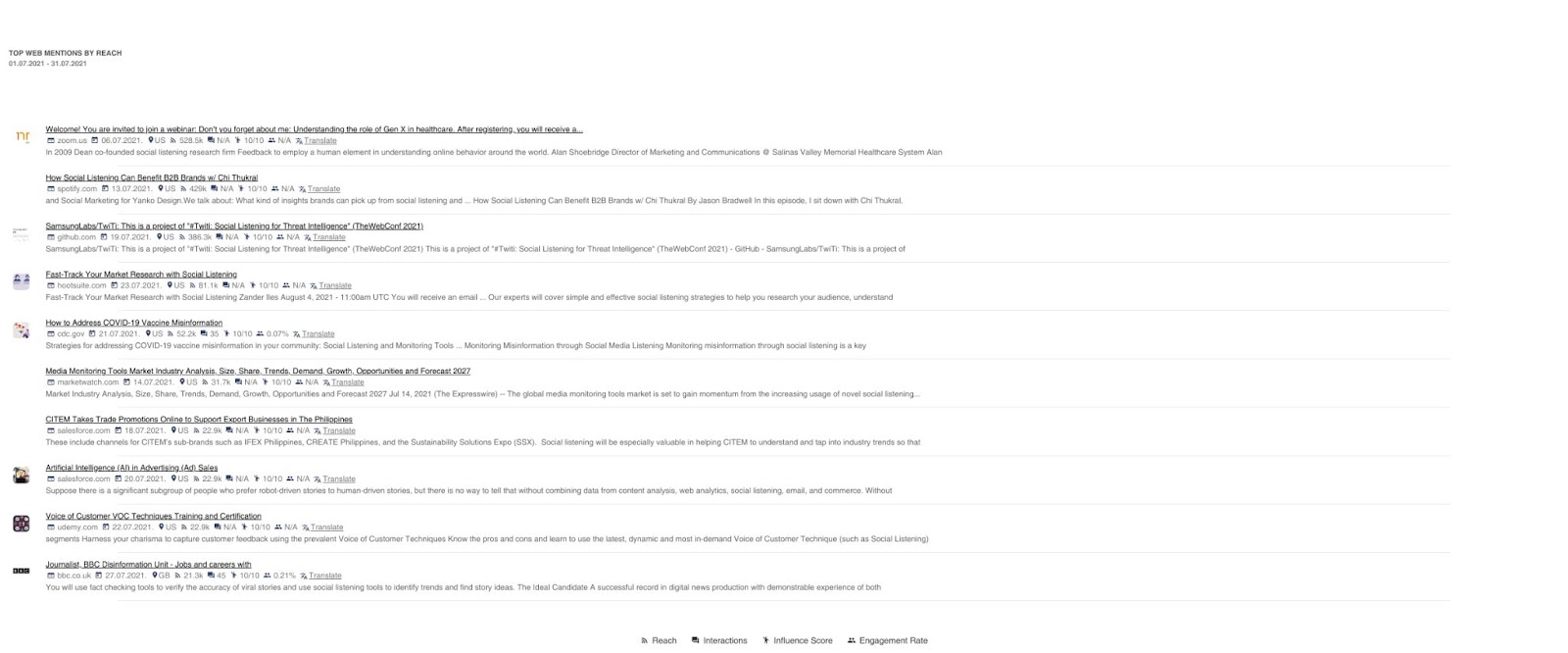
You can adjust the sorting and the source type for mentions shown in a Mention chart. For instance, you can create a Mention chart that will be sorted by reach, while also filtering the sources to include only Twitter. As a result, you will get an overview of the top Twitter mentions by reach.
Here’s how to create one:

This is just one of the ways a Mention chart can complement your custom dashboard. The Mention chart can be a standard or full-sized chart, depending on your preferences.
Sentiment by tag chart example
Another exceptional example of having an in-depth insight into a topic of interest is the Sentiment by tag chart you can create.
The idea behind this is that you dive into the sentiment for each tag you assign to your mentions, either manually or via Automated actions. That way, you can assess the attitude towards a certain characteristic, category, or any other feature you might tag in your mentions.
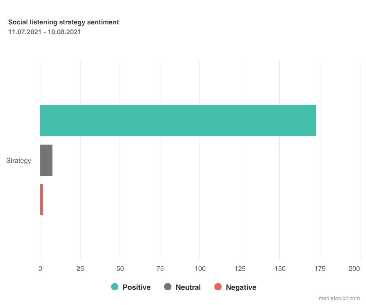
You can also create a custom chart for multiple tags simply by adding more of them. A great use case for such a custom chart is to gain a deeper understanding of each aspect of your industry, product, or service.

In the image above, we created a custom Sentiment per tag chart for our social listening topic. This way, we can track the volume of mentions for social listening tools, strategy, and trends, as well as monitor the amount of positive, neutral, and negative mentions among each category.
Here’s how to create one:

There are plenty of ways such a chart can be utilized. A coffee shop can use tags such as ‘Service’, ‘Staff’, ‘Cleanliness’, ‘Interior design’, ‘Comfort’, ‘Coffee variety’, ‘Pricing’, and more to categorize the feedback they receive online. Then, using a custom chart encompassing said tags, they would examine the sentiment for each business aspect to see what is performing great, and what could be improved.
With a bit of creativity, the opportunities are virtually limitless.
Quarterly report dashboard example
The great thing about a custom dashboard is that you have complete control and creative freedom to compile and present data as you wish.
That comes in handy when reporting on the success of your communications efforts for an entire quarter. You want to have the freedom to mix and match data from different months, sources, or even topics.
To demonstrate the full capabilities of Determ, we created a quarterly report dashboard with all the data you would need at a glance, as well as a breakdown of the most important information per month of the quarter. Here is our take on it:

As you can see, this custom dashboard contains an abundance of customization. We have combined predefined charts from the Basic, Advanced, and Competitive analysis dashboard and a fully custom chart.
Some of the charts we have tweaked in terms of time so that they are limited to a single month, as opposed to the rest of the charts that cover the period of the entire quarter…
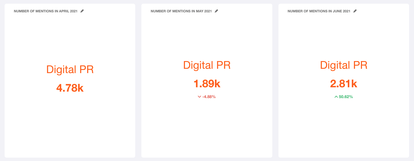
…some combine data from two topics, just like in a Competitive analysis…

…and there is a custom Mention chart to showcase top Twitter mentions by reach, all in one dashboard.

Whether you want more data, select data, or adjust the way data is displayed, custom charts and dashboards should be your go-to. You can follow suit and tailor your dashboards and charts to your exact needs and preferences when it comes to data delivery and visualization.
Need a different way to display your data? Edit the chart type of a predefined chart or create a new one from scratch. Want more detailed insight into your media intelligence, or better yet, want to prune unnecessary data from your report? Play around with your custom dashboards and create the perfect one. As we said, the possibilities are endless.
How to Create a Custom Dashboard
Custom dashboards are a great way to view only the most relevant data for your business, campaign, or goals. There are plenty of ways you can tailor your dashboards to your exact needs, as there are more than 2000 possible chart combinations you can add or adjust.
And here’s a full walkthrough, should you need more detailed instructions.
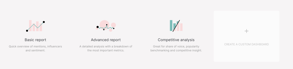
To create a custom dashboard, click on the Reports button on the top of the screen. In the window that pops up, you’ll see the three default dashboards, as well as a Create a custom dashboard option. Click on the plus sign to create the dashboard.
A new window will open up:

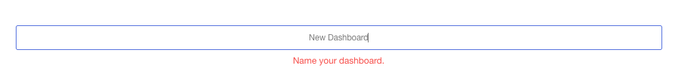
Firstly, name your dashboard. If you are creating a custom dashboard, you likely already know what you need it for – let the dashboard name reflect that. For example, you can create one dedicated to sentiment analysis, influencer collaborations, quarterly media reports, and more.
For this tutorial, we’ll name it New Dashboard.
Then, you can choose between modifying presets or starting a custom dashboard. We’ll go with the latter, but you can apply the same principles we’ll demonstrate in just a bit if you simply want to modify a predefined dashboard.

Finally, choose your source. Click on the drop-down menu Choose topic or folder, and choose either a topic or folder from which you want to pull data for your dashboard. You can choose multiple folders or topics.
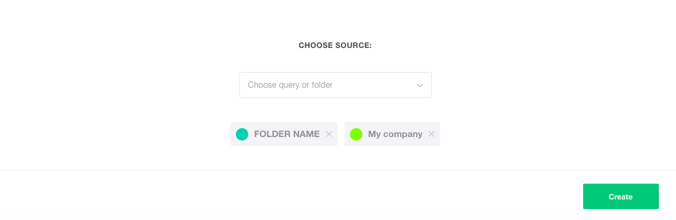
Click on the green Create button to create your custom dashboard.
Once you’ve clicked Create, a new window will open:

This is your new dashboard; a blank canvas ready to be filled with charts of your choice.
Creating a custom chart step-by-step
The next step is adding charts to your dashboard. To do this, click on the plus sign: Add a new chart.

You can choose from the list of predefined charts to modify or create a fully custom chart. To create a custom chart, click on the Custom chart option or type “custom chart” into the search box at the top of this window:

After you click Save, you’ll be able to modify your newly created chart. There are several options here, with a Chart preview being at the very top to demonstrate the result of your chart setup.

1. Choose a topic to analyze

Even though you’ve already chosen a folder (or folders) for your custom dashboard – you can still edit that choice for each chart. If you’re happy with your choice, continue to the next step.
2. Choose a chart type

There are 17 chart types. To choose one, simply click on the chart type you want to use. You can always come back to this step and choose another chart type that might work better.
3. Chart time
In this step, you can set up the time period for your chart. You can choose between an hour or day as a time step (click on one or the other in the Time step drop-down menu).

Click on the date box (From and Until) to open the calendar. Then click on the dates you want to set or select from the options on the right.

If you want to compare data with a different period, click on Compare periods. In this case, you can only use the calendar option to set the period (by clicking on the date boxes).

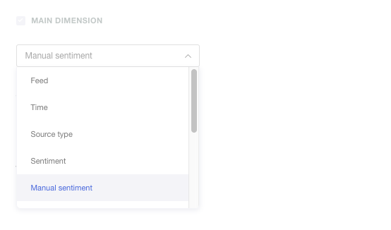
4. Main dimension
This step includes choosing the main dimension you want to analyze – the base of your chart. There are 11 different dimensions:
- Feed
- Time
- Source type
- Sentiment
- Manual sentiment
- Effective sentiment
- Language
- Location
- Influencer
- Tag
- Word
In the main dimension drop-down menu, just click on the dimension you want to analyze and you’re ready for the next step.
5. Sorting
In this step, you can choose between sorting by key or value.
- Sorting by key means the data will be sorted chronologically (for instance, if your chosen dimension is Tag, your data will be sorted by the time the tags were created).
- Sorting by value means your data will be sorted from the biggest to smallest value (or vice versa, depending on whether you chose the ascending or descending order).
Then, you can choose if it will be in a descending or ascending order.

To choose either ascending or descending, click on the arrow on the right of the drop-down menu. The picture above shows the descending option (circled in red).
Examples
Picture 1. Descending order (sentiment sorted by value); chart type: Numbers

Picture 2. Ascending order (sentiment sorted by value)

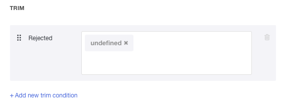
6. Trim
If you want to limit your results – for instance, only include Top 10 Influencers and not all of them – you can use the Trim option.

There are five trim conditions. To choose either one, just click on them.
Trim conditions
- Top N: limit the number of results on the chart (e.g. the above mentioned Top 10 Influencers)

- Non zero: this option excludes data if the result is 0

- Allowed: includes only parameters entered (just type parameters you want to be included in the box; press Enter after each parameter you type out)

- Rejected: excludes entered parameters (type parameters in the box and press enter after each parameter)

- Merge other: you can define the rank (after which the data will no longer appear) or percentage (below which the data will no longer appear)

For instance, if you choose a sentiment as your main dimension, you can trim the results by using the trim condition Rejected (this way, you can exclude sentiment that is undefined simply by typing that word in the Rejected box and pressing Enter).
The same would go for an instance in which you maybe want to exclude some sources from a particular chart.
Say you don’t want your custom chart to include web mentions. You can achieve this by typing “web” into the rejected trim option. However, keep in mind you can only do this if your dimension is the source (main or sub-dimension). You can play around with your custom chart until you get what works best for you.
Tips & tricks
- Adding trim conditions: If you want to use more than one trim condition, click on Add new trim condition, after defining the first one.
- Deleting trim conditions: If you change your mind, you can always delete the trim condition by clicking on the trash bin icon on the right of every trim condition.
- Removing parameters: Additionally, you can remove the Rejected or Allowed parameters by clicking on the X on the right of each parameter.
7. Sub dimension
In addition to your Main dimension, you can also choose a Sub dimension you want to be analyzed. You activate it by clicking on the little box on the left of the Sub dimension title.

You can sort and trim the data in the same way as the Main dimension for the sub dimension.
Additionally, you can switch the sub-dimension with the main dimension by clicking on the arrows icon on the right of the sub-dimension title.

What happens here is that the sub-dimension becomes the main dimension, and the main dimension becomes the sub-dimension.
8. Chart value
The chart value option allows you to choose between five value options:
- Count
- Reach
- Interactions
- Virality
- Influence score
In the drop-down menu, just click on the one you want:

There is also a Merge operator option that allows you to choose if your data will be shown as a sum, minimum, maximum, or average:

To finish creating your custom chart, click on the green Save button.
For more information on how to create a Branded configuration or a Branded report, in general, click on the link below. 💡
👉 Branded Reports: Elevate and Automate Your PR Reporting
Summing up on custom charts and dashboards
As you can see, custom charts and dashboards offer endless possibilities when it comes to creating different and unique perspectives on media intelligence.
Whether you strive for a certain report layout or want a completely new take on the output of your data, you have full control over how your media monitoring analytics are curated and presented.
Equipped with all this knowledge, you’ll now know exactly how to get the most of your media analytics. Want to give it a go? Log in to your Determ account or drop us a line in the tool chat if you need any guidance with custom charts and dashboards.